How we write our name, how we use our symbols — these are the closest we get to a "signature" for Diary AI. How they appear, whether tiny on a screen or enormous on a billboard, becomes a crucial way for our users to find and trust us.


Logotype
Primary Logo
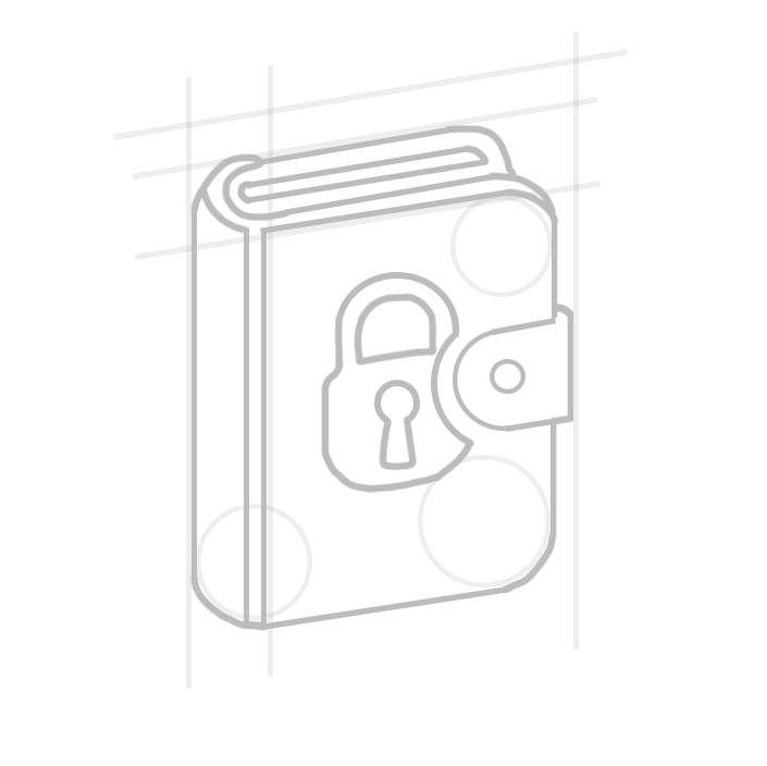
Our primary logo combines the diary icon with our wordmark. The locked diary symbolizes privacy and personal reflection, while the clean typography represents clarity and simplicity.
The logo can be used in black or white, depending on the background. Always ensure adequate contrast for legibility.

Dark on Light

Light on Dark
Logotype
Color Variants
Use the dark logo on light backgrounds and the white logo on dark backgrounds. Never use colored versions of the logo unless specifically approved.
Logotype
Clear Space
To allow our logo to stand out, do not place any objects such as graphics or text in the clear space shown. The minimum clear space should be equal to the height of the diary icon.
Screen
Logotype
Minimum Sizes
The logo should always be legible. Never use it at sizes smaller than specified. For digital applications, maintain a minimum width of 100 pixels. For print, never go below 25mm width.
Icon
App Icon
When space is limited, such as app icons, favicons, or social media profile pictures, use the diary icon alone without the wordmark. This maintains brand recognition at smaller sizes.
Logotype
Logo Misuse
To maintain brand consistency, please avoid the following common mistakes:
Don't stretch or distort
Don't rotate
Don't change colors
Don't add effects
Don't crop
Don't use low contrast
Color
Brand Colors
Our color palette is intentionally minimal, focusing on black and white with carefully selected grays. This creates a clean, focused aesthetic that lets our users' journal content take center stage.
Primary Colors
Black
#000000
RGB 0, 0, 0
White
#FFFFFF
RGB 255, 255, 255
Light Gray
#F3F4F6
RGB 243, 244, 246
Secondary Colors
Gray 200
#E5E7EB
Gray 400
#9CA3AF
Gray 600
#4B5563
Gray 800
#1F2937
Color Usage
Use black for primary text and headings
Use white for text on dark backgrounds
Typography
Brand Fonts
Our typography system uses two carefully selected font families that balance readability with personality. These fonts work together to create a cohesive visual language across all Diary AI communications.
Aa
Proxima Nova
ABCDEFGHIJKLMNOPQRSTUVWXYZ
abcdefghijklmnopqrstuvwxyz
0123456789
Primary
Proxima Nova
Proxima Nova is our primary typeface, used for headings, body text, and UI elements. Its geometric yet friendly aesthetic ensures excellent readability while maintaining a modern, approachable feel.
Light (300)
Regular (400)
Medium (500)
Bold (700)
Black (900)
Aa
Proxima Nova Condensed
ABCDEFGHIJKLMNOPQRSTUVWXYZ
abcdefghijklmnopqrstuvwxyz
0123456789
Secondary
Proxima Nova Condensed
Proxima Nova Condensed is used for accent text, labels, and space-efficient layouts. It maintains the same friendly character as the primary font while offering a more compact appearance.
Regular (400)
Medium (500)
Semibold (600)
Bold (700)
Type Scale
6xl / 60px
Display
4xl / 36px
Heading 1
2xl / 24px
Heading 2
xl / 20px
Heading 3
base / 16px
Body text for paragraphs and general content.
sm / 14px
Small text for captions and secondary information.
Guidelines
Do
- • Use consistent font weights for hierarchy
- • Maintain adequate line height (1.5-1.6)
- • Use serif fonts sparingly for emphasis
- • Keep body text at 16px minimum
Don't
- • Mix more than two font families
- • Use decorative fonts for body text
- • Set text smaller than 14px
- • Use all caps for long passages
Download Logo Assets
Get all logo variants in PNG, SVG, and PDF formats.